
Sweetness: Brand Identity
Overview
Sweetness is a revolutionary ice cream brand that prioritizes safe and organic ingredients that are not only healthy but satisfies sugar cravings. It was established in January 2025 by the founder, Carol Smith. The company’s ability to create ice cream using stevia is a unique standpoint compared to their competitors. It is a better health-alternative ingredient that does not compromise the smooth and creamy taste of ice cream.
Challenge
When it comes to the original design, Sweetness had a bright pink hue along with white “frosting” borders as their main color palette. Even though the original visuals were eye-catching, it did not cater to the target market that the company originally wanted. The owner had envisioned the brand to be towards individuals who are more health-conscious with their diets. The design had a sense of youthfulness which became more appealing towards children instead of adults.
Solution
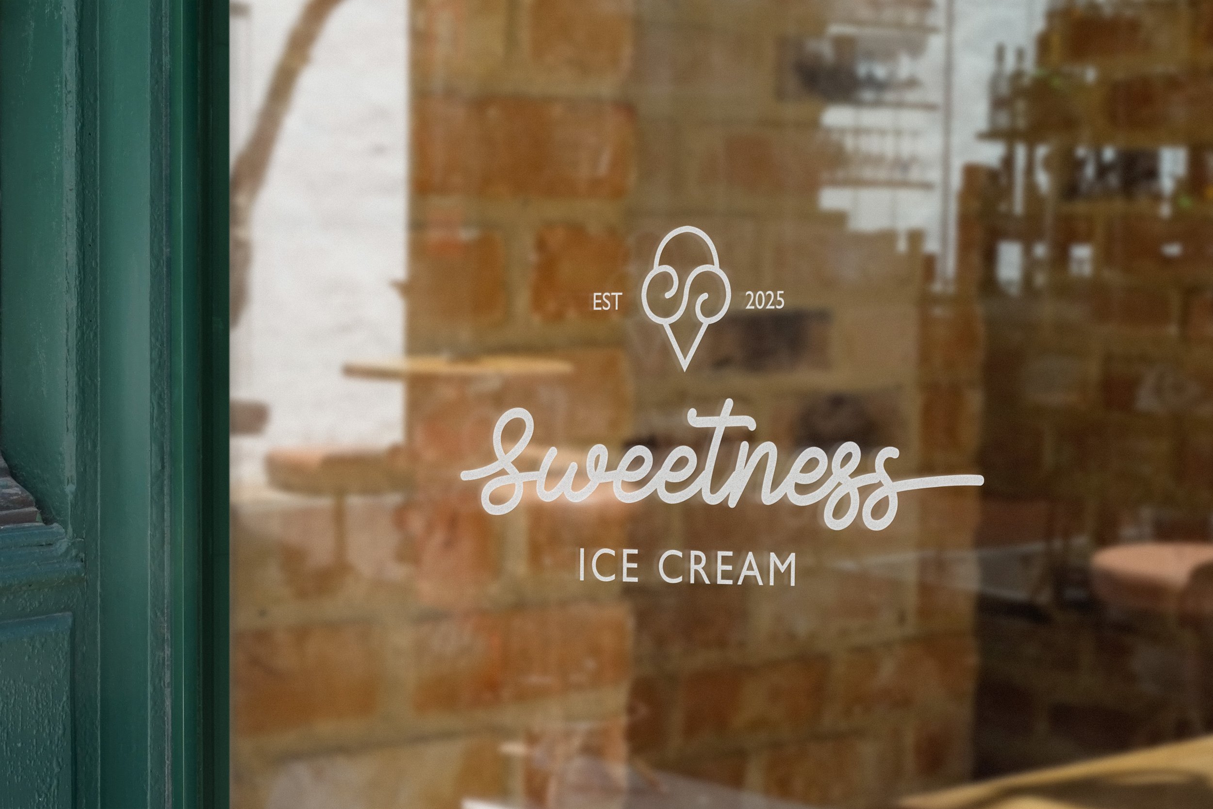
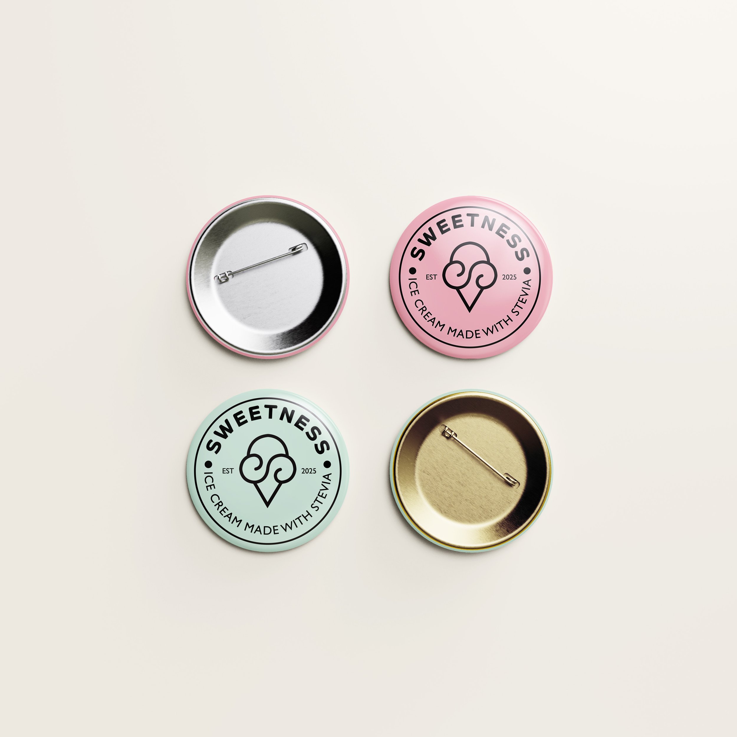
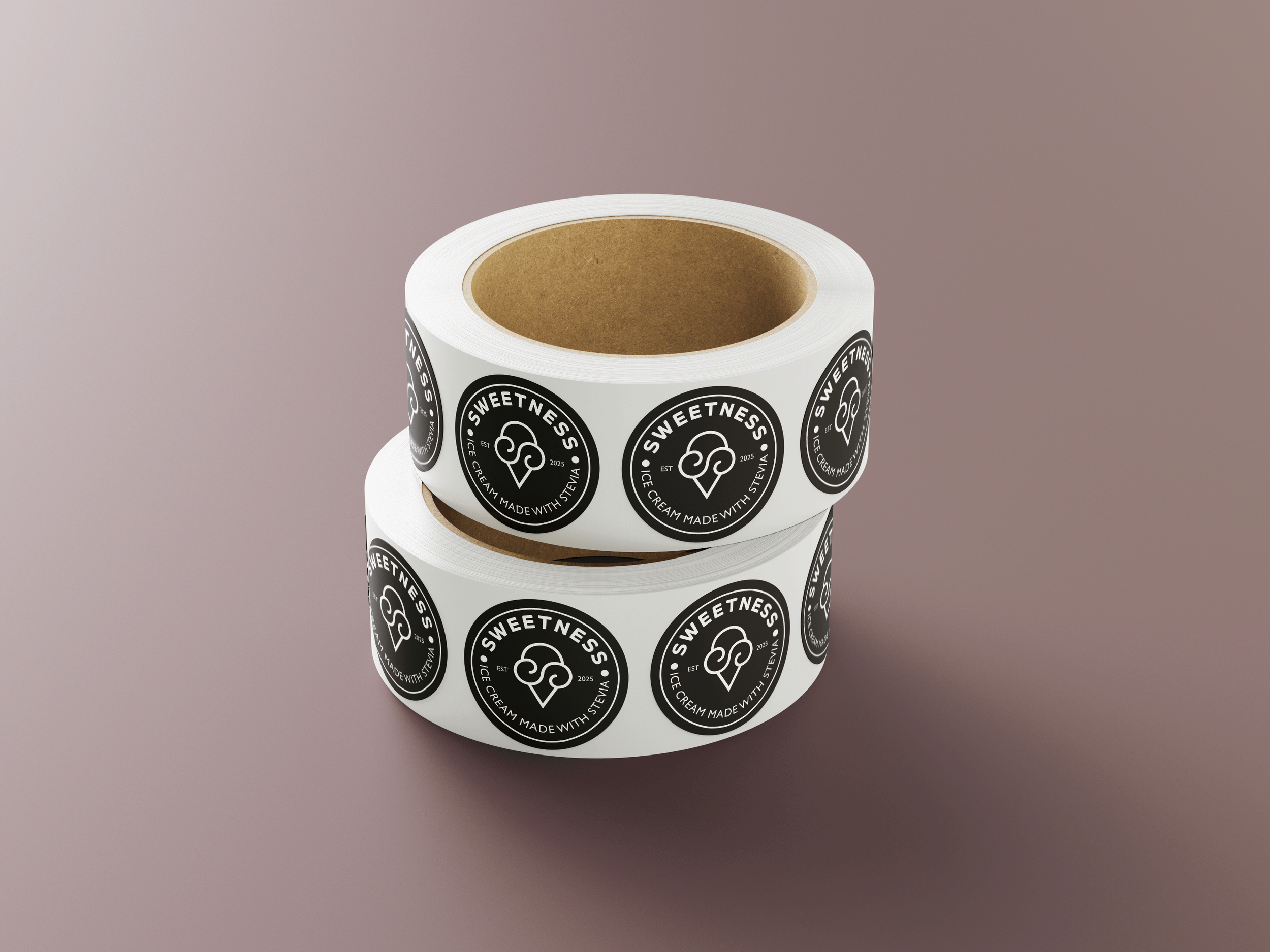
As an independent designer, my priority is to create a new visual identity for the company that caters towards individuals that are ages 30 and up. The logos, typography, color palette, and marketing collaterals would showcase the benefits of buying this ice cream. The final designs contain minimal soft pastels with a grown-up twist. The use of stevia in the ice cream has been labeled on the cap so that the consumers are aware of the brand’s main selling point.
Roles & Duration
Timeline: 3 Weeks
Role: Art Direction, Branding, Packaging, Social Media Design
Team: Solo Project
Tools: Adobe Photoshop, Adobe Illustrator, Adobe InDesign, Google Docs
Process: Research, Ideation, Design, Reflection
Research
Brand Values & Competitors
Before delving into the visual design, I did extensive research on current ice cream and frozen yogurt brands that have similar core values as Sweetness. It is vital to understand my competitors' marketing strategies and designs to understand how to make Sweetness’ brand identity stand out. The companies that are similar to Sweetness are: Yasso, Skinny Cow, Alec’s, Goodness, Halo Top, Van Leeuwen and Jeni’s. Also, I took a look at the core values, statements and benefits from the Sweetness brand to generate design ideas for the visual identity.


Ideation
Moodboard
After doing the initial research, I began to brainstorm the style of the company that is suitable for the brand. Sweetness embodies the themes of healthiness and minimalism based on the brand values. I gravitated towards pastel colors with a minimalist style. The colors have a nostalgic feel to it but it is a bit muted to create a sense of sophistication and maturity for the brand’s demographic. The fonts that I have chosen evoke a sense of professionalism and boldness that ties in with the entirety of the design concept.

Design
Application
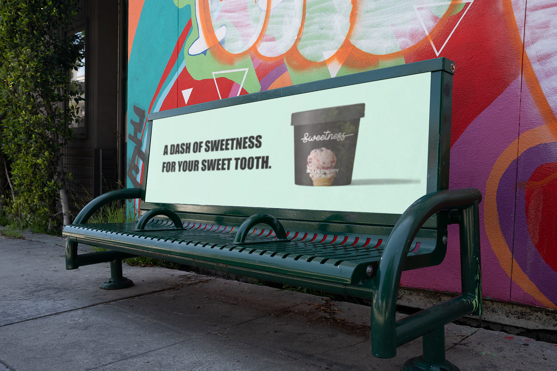
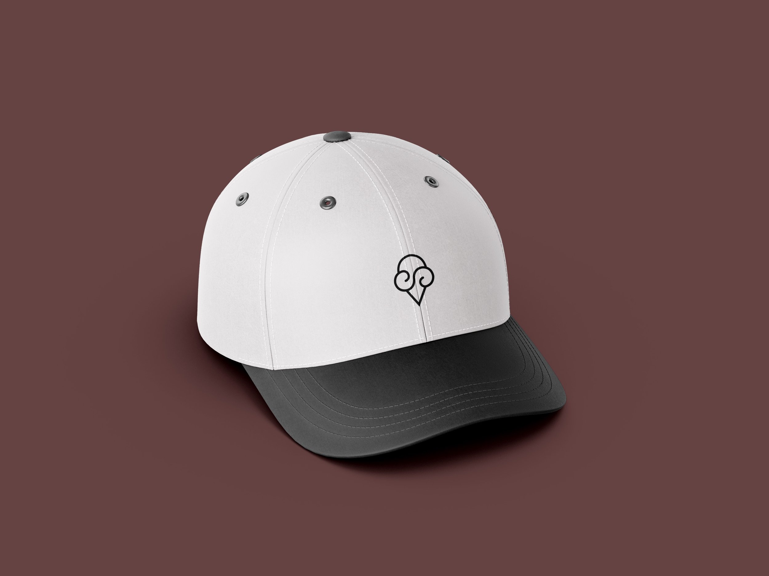
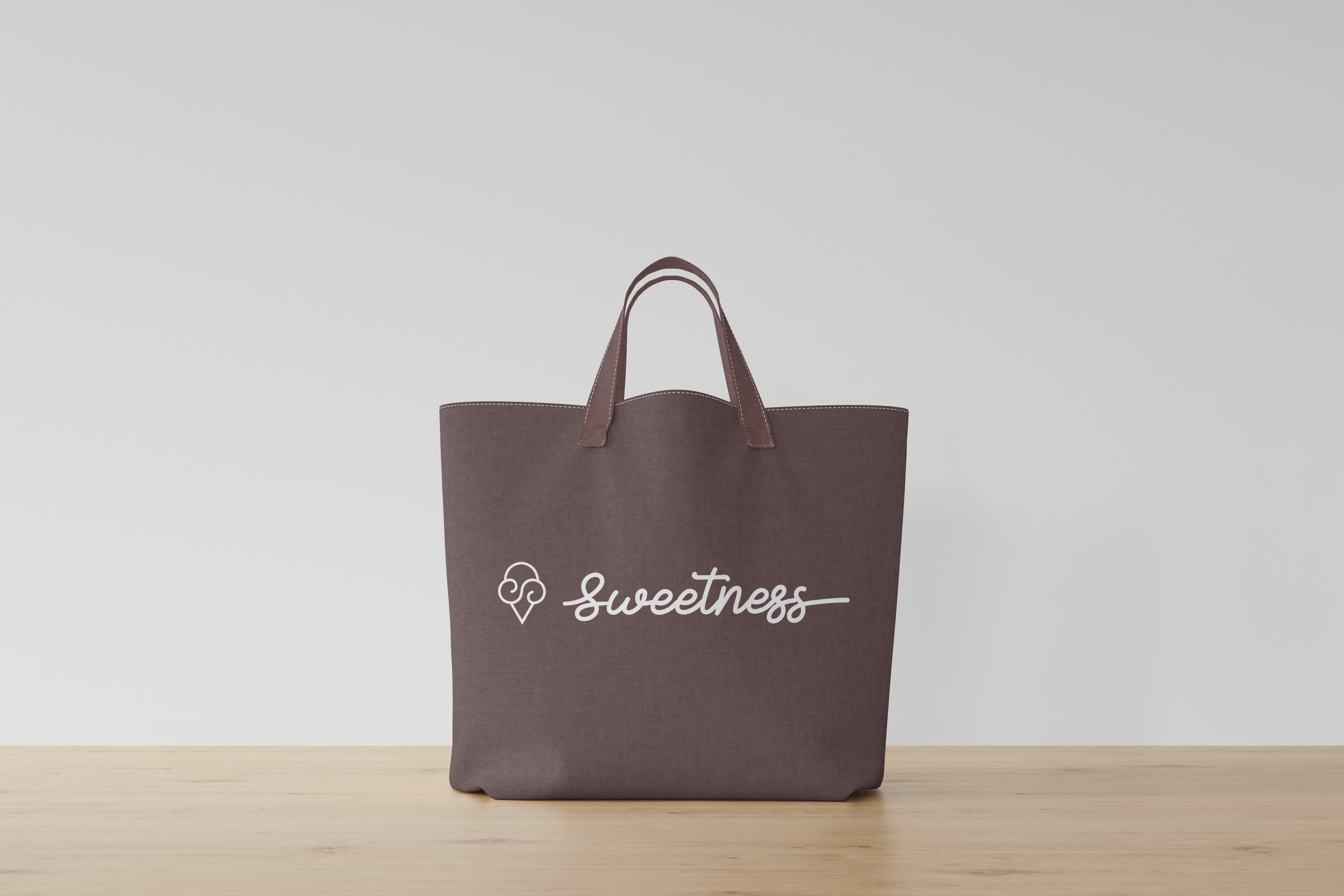
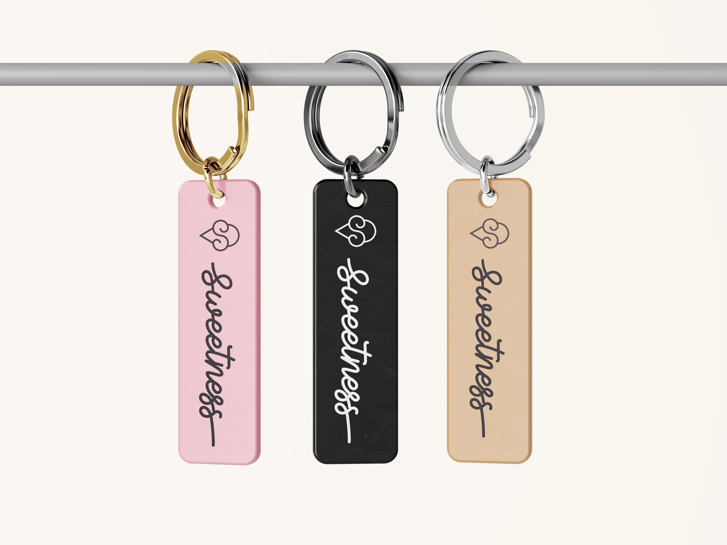
Aside from creating a brand direction for all of the current ice cream flavors, I also created some social media posts to promote the brand and develop a connection with the consumers. Furthermore, I created merchandising items that are simple but create a fun touch to the brand.

Sweetness’ slogan is “Made for your sweet tooth” because the brand would like to offer tasty desserts that do not weigh in towards high sugar doses. The minimal design is connected to the brand value of using simple ingredients that are natural and transparent for the consumers.


Reflection
Application
The goal of Sweetness was to create a brand direction that caters towards adults who are looking for ice cream that tastes delicious without sacrificing their physical health. The brand has a fresh, modern design that indicates the use of stevia for their consumers. They now have a sophisticated presence to their physical and digital spaces.